getting on with some Textiles exercises

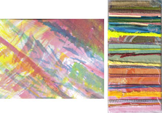
I’ve been conscious that though I’ve been doing lots of of textile-y and colour-related things, which I’m sure contribute to the learning curve I’m on with OCA Textiles 1, I haven’t done any actual exercises since August, so yesterday I sat down and did the next two from the course folder. The first involved choosing images that have a colour scheme I feel drawn to and collecting fabrics and threads to match the colours. This was fun – I chose a couple of postcards – one is of the stained glass window designed by Patrick Heron for the Tate in St Ives, Cornwall, and the other is Liesbeth Lange’s photo of ‘Colours from Nepal’ – I guess they are dyes, but I don’t really know.

matching colours

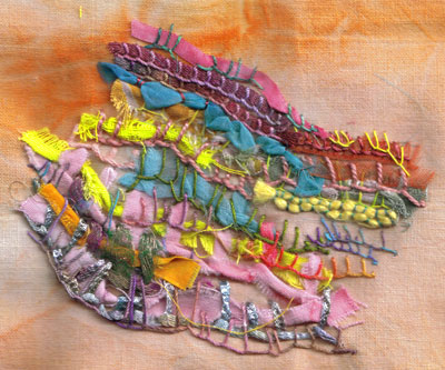
The second exercise was to stitch onto a black background using two primary colours. I am finding that the more I hand stitch the more I enjoy it – it takes time, which I lack, but the patterns are so lovely and I’m fascinated by the variations that grow between one stitch and the next.

stitching with primary colours

I’m off now to make a few sample paper beads to take to youth club tonight, but I must just mention a magazine I read about yesterday on MissMalaprop.com. Worn Fashion Journal sounds like a great publication for anyone who’s interested in fashion design, wearable art or the cultural meanings of clothing.

happy and sad

In OCA Textiles 1 right now, I am working on the use of colour to convey concepts like happy/sad… and how resistant I am to putting sadness onto my paintbrush. Maybe because I have been feeling a little sad myself this week, I want – I only want – to paint colours that bring me joy. Interestingly, the word ‘sad’ was once commonly used as an adjective for colour, meaning

Dull; grave; dark; sombre; – said of colours. “Sad-coloured clothes” (Walton)
“Woad, or wade, is used by the dyers to lay the foundation of all sad colours” (Mortimer) dictionary.net

Sad colours were deep and dark, neutral, sober. In the OED I read that in the 18th century chemicals were added to dyes to ‘sadden’ the colours – to tone them down. So could I bring myself to sadden my colours – maybe a very dull and dirty looking brown would do it, or a constricting, choking black?

sad colours

sad colours

Debussy wrote

The colour of my soul is iron-grey and sad bats wheel about the steeple of my dreams.

Which is how I often feel. Yet even those greys and browns and blacks (or blues) – well, I wonder – I can’t help feeling that even the drabbest dingiest colour may be singing away quietly to itself in its own understated way, hiding a dark rainbow in its depths.

Really, in my head and my heart I’m with Calvin (for once)

There is not one blade of grass, there is no colour in this world that is not intended to make us rejoice. John Calvin

joy colours

joy colours

colour matching fun

First – for Arlee – the appliqué images from my last post – now clickable – I’ll make sure to do this in future wherever I can.

applique designapplique design with organza

On Sunday I got out the acrylics and gouaches – sets of 6 (lemon, cyan, magenta, yellow, vermilion, and ultramarine, plus I have black and white) and did some colour matching exercises for OCA Textiles 1. This involved mixing colours and documenting the results, matching the colours in fabric using paint, and really looking at the range of colours in an image to try and record them accurately. And the painting in the sketchbook was just to use up the leftover paint!

colour work

When I was cleaning the palette after using the acrylics, of course I had to scrub it, and some of the effects were quite interesting in themselves. This is the last small patch – just a few cm across – I can’t bring myself to scrub it right off yet!

acrylics on the palette

Did anyone see Germaine Greer’s very provocative comments in the Guardian yesterday? I have a lot of thoughts buzzing round in my head after reading this – I need to sort them out from my emotional responses and get them written down. There’s a (slightly dizzying) video on YouTube of work by Edrica Huws, the artist whose exhibition Greer didn’t actually see. What might she have written if she had bothered to go to Anglesey to see the show and look for the answers to her questions?

weekend’s work

I’ve been painting some colour wheels for OCA Textiles 1 – they didn’t turn out quite as I expected, though. I was using Brusho inks and I don’t know if it was the way I mixed them but the lemon and the golden yellow were so similar in hue that I didn’t get all the variations I was expecting. I’ll have another go with some gouache paints. Then I spent a bit of time mixing tints and tones in acrylics and experimenting with mixing in touches of a complementary colour. I could do this kind of thing all day long – I just love it.

mixing colours

I’ve also been painting silk organza and pongee for my appliqué hanging for City and Guilds – one piece of each in reds, one in greens and one in purples. These are fronts and backs to go with these felts. The next stage is to machine quilt the three layers, incorporating shadow applique, then cut back into it to expose some of the felt. The organza will be the top layer.

silk

I found this picture on the camera as well – it’s the sky from my office window, one evening a few weeks ago when it wasn’t quite as wet as today!

Kendal sky

first assignment is sent!

We got back from Portugal late on Saturday, and I spent Sunday packing up my first assignment to post for OCA Textiles 1  – it took ages to label everything and write an evaluation of each project completed so far. The writing is much harder than the art work! I don’t think I’m keeping enough information in my logbook – which is partly this blog – I need to review the books I’ve been reading and get better at annotating my samples as I go along.

These are the last couple of pieces I did to explore texture in stitch. In the first one I was trying out different ways of stitching with tension adjustments to create contrasts of texture. It looks a bit like an allotment, though that was unintentional -  it’s interesting how the work sometimes goes in a direction all of its own.

texture with machine stitch

The other sample is intended to show proportions of colour and texture using different yarns, and is based on a drawing I did using a feather and Brusho inks. I like the way the colours turned out but it’s not very feathery!

wrapping colours
texture with yarns

Although my camera wasn’t working, I managed to take a few pictures in Portugal on my friend’s camera (where they still are). I’ll upload some of them as soon as I get them.

A lot of work seems to have mounted up while I was away so I’m playing catch up before plunging back into the quilting. I’ve got a couple of packages of silk to paint and dye – so I hope the sun will still be shining in a couple of days’ time!