stitch samples

I’ve been working on the next stage of OCA Textiles 1, which is using stitch to make marks, lines and textures. I’ve been trying both machine and hand stitching – I’m always in such a hurry I tend to think ‘machine’ first, and I’d forgotten what a pleasure it is to sit and stitch by hand. Especially with La Traviata on the CD player and the sun shining 🙂

machinemarks.jpg
revisiting some of my pencil marks and lines in stitch

chair.jpg
a machine stitched sample based on something linear from my sketchbook

stitches.jpg
playing with hand stitches to create texture

I got some Koh-I-Noor watercolours from Art Van Go on Tuesday, plus a new tiny sketchbook for my handbag, and a Aquash paint brush with a water compartment. I christened them all with a sketch of my little dog, Tansy the Tibbie, asleep on her favourite chair. The brush is quite hard to hold as the handle’s so fat with the water reservoir.

tansy.jpg

brusho and bleach…

… are what I’ve been playing with today. Along with wax crayons, water colours and the odd feather. Inspired by reading A Sketch in Time by Jan Beaney and Jean Littlejohn, which I suddenly remembered I had, I’ve been adding more marks and textures to my sketchbook.

bleach and brusho inks

I’m nearly ready to start stitching! The second half of this first project in OCA Textiles 1 explores the use of stitch in markmaking and creating texture, based on the mixed media studies created in the first half. I have till the end of the month – no pressure there, then – plus a few work deadlines to meet, so I may not be sleeping much in the coming week.

I heard about a new book today (thank you Sue) by Claire Benn and and Leslie Morgan of Committed to Cloth and Jane Dunnewold – Finding Your Own Visual Language: A Practical Guide to Design & Composition; the blurb says:

“this book aims to help those who are seeking a surer artistic voice by providing practical exercises and guidance on different ways forward”

I’m really tempted – even though I have quite a few design books already – as I’m very interested in what the authors are doing with art cloth and surface design.

expressive markmaking

I’m struggling a bit with the exercises in expressive markmaking for Open College of the Arts Textile 1. I can spend hours making marks – some that I like, some that I don’t, in different media and with different techniques, but I don’t naturally see any of them as expressive of sadness or happiness, even when I am trying to convey these specific emotions. I am making judgments about them, but not related to mood. I see them as interesting, boring, ugly, beautiful, etc, and I don’t have too much trouble with strongly visual words like sharp, smooth, delicate, but I get more doubtful when it comes to words like fast and slow, hard and soft. That is – I can relate those words to the gestures I’m making when I make the mark, but when I look at the mark, it doesn’t seem to reflect the speed of the gesture. Or a softly placed mark doesn’t say ‘soft’ to me.

Not sure where I’m going with this, just getting the thoughts out.

While I was musing and wondering about it yesterday I googled for expressive markmaking, and rediscovered TRACEY, an online journal devoted to contemporary drawing research. Specifically the issue on Syntax of Mark and Gesture. Masses of material here – I’ve bookmarked this to read over the next week or so. Following their links I also looked at Access Art and their online workshop ‘Draw!‘. After that I thought I am just being too precious ahout this and I sat and brainstormed in my journal some other evocative words and visual ideas around what sadness and happiness mean to me.

happy and sad words

During the week I’ll spend some time finishing the exercise by making marks around these thoughts. But today I’m going to go on to the next stage, using marks to create surface textures.

These are some of my favourite efforts from yesterday. I notice they are all paint, except the first which is a candle resist with an Inktense pencil wash. The results I get drawing with pastels, crayons, etc don’t grab me much – maybe an indication that I need to spend a little more time getting to know these media. They work well for me in rubbings, stencils and so on, but not when it’s just me and my bare hands!

markmakingmarkmaking

markmaking

markmaking

exhibition report: Jo Budd – Beyond Surface

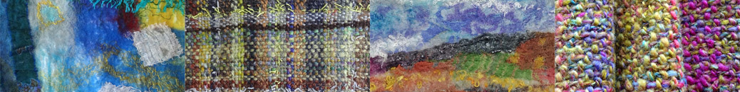
Yesterday I went to Farfield Mill to see the Jo Budd exhibition that’s showing there as part of the Women’s International Arts Festival. It was well displayed in a light airy room, walking in was like walking into a song of colour, a first impression of acid greens, rust, greys and shining yellows, sky shade blues, ochres and earth tones. Very visually stimulating. The work is an exploration of the colours and layers of landscape, seen through painted surfaces and layers and depths of translucent colour.

From the artist’s statement:

“A new studio in a new location, looking over river marshes, and a new dyeing technique using rust and water, have given me a fresh set of colours and marks to play with.”

“Focusing on surface but refocusing on the layers, in land, water and sky – these are the qualities which fascinate me.”

The work shown dates from 1998 – 2007, some glazed pieces and some hangings. Jo Budd collages and quilts dyed and painted fabrics, on a large scale. Lines of stitches create shadows and depths. Fabrics are sheers, cottons, silks, juxtaposed and layered to create wonderful plays of colour, light and atmosphere.

Corrugated Iron (1998) is a large piece maybe 8 foot by 6 foot. It’s pieced and layered appliqué, with the painted marks very evident, both paint and stitch expressing the lines of corrugation. There’s an image of this striking piece with an essay and some other examples of her work, on Celia Eddy’s QuiltStory web site.

Rust Series (2007). This is another large piece about 6ft square, one of a series of pieces using rust-dyeing. The effects create a dramatic texture. Lines of long yet fine stitching that define some areas. The colours are cool browns and greens, blues and greys, exploring shape and movement. Colours change subtly where the fabrics overlap.

Fields of Green (1999) – I think this was the piece I was most drawn to. Strong horizontal bands of greens, stitched and dyed, lustre of silk and flatness of cotton. A smaller piece,about 3ft by 4ft, but it drew the eye from the moment I entered the room with the intensity of the colours and the stitched textures.

All the work gives me a strong sense of celebration of the incredible beauty of landscape, and the expanses of land and sky that characterise a flat country. Driving home, I was seeing the colours of my own Cumbrian landscape, different though it is, in a new way. I found the exhibition very inspiring. I love the effects of paint and dye on fabric and the depths that build up. I love the intense and subtle colours Jo Budd creates. I especially like the intrinsic connection between the rusty marks and the subject material of her work.

I hope I’ll get to see this work again at the Festival of Quilts.

mark making

I spent some hours over the weekend making marks with hard and soft pencils, charcoal and conte pencils, mostly on A3 sheets – experimenting with expressing different words visually, and with the variations in tone from using different pressure and density of marks. I discovered that my marks have a definite tendency to try and become patterns, and that I love the smudginess of partially erased shaded areas.

pencil and eraser