assignment 2 is done!

I knew it had been a while since I last blogged but I was a bit surprised to see just how long. I have a good reason, though – I’ve been immersed in finishing my second assignment for OCA Textiles 1, finally put in the post (just) on time on Monday. It takes ages to get everything labelled and organised for sending to my tutor – I must try to do more of that as I go along. These are the two larger printing/painting samples I finished at the weekend. The top one is a repeating pattern that could go off the edges of the fabric – scrunch dyed cotton fabric, block printed with fabric paints, then stencilled with masking tape stencils in two layers, the first layer applied with a natural sponge, and the second layer applied with a sponge roller. When I’d done that, I thought the purple stripes were too strong against the background fabric, which was quite pale in places, so I painted the whole thing with thin turquoise paint and then rinsed it before setting.

The bottom one is a single unit inspired by log cabin patchwork. It’s all block printed, the ‘log cabin’ with funky foam blocks with holes punched into them, and the round shapes with carved erasers. The fabric is silk, and I used fabric paints as I wanted that brushy texture in the colour.

printed fabric

printed fabric

The next section of the OCA course is fabric manipulation and making an actual object like a bag or a waistcoat, which sounds great, but I must also finish the appliqué piece and get on with the final assessment for City & Guilds. I think if I really pull out the stops I might be able to finish it before my registration runs out in mid-December.

more French knots and other dots

I hoped I would get a bit more done last week, art-wise, than I did, but there was more work (day job) than I expected (which is good, really) and so in the end I was squeezing the art in around it. I did the machine quilting on the second of three panels for the appliqué assessment in my quilting course, and started on the hand stitching. It’s crazy, really, to be doing large amounts of hand stitching on a project like this when time is short, but I am, because when I decided to do that, it turned from an assessment piece I ‘had to get done’ into something that I feel engaged with and might even want to look at again afterwards.

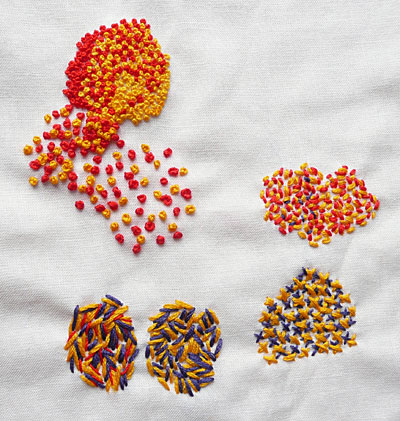
For OCA Textiles 1, I’m still working on the pointillist stitching exercises. I tried some different stitches…

pointillist stitching

… and then French knots at a different scale, though not (yet) with rope as envisioned by Jude in her comment! This was just tapestry wool on canvas.

pointillist stitching

I enjoyed this exercise, which was to blend pastel colours across a sample. Though I had to scrape the barrel a little to find any pastel colours at all in my thread collection – just a few silks left over from something I made for my niece when she was a baby (she’s practically a teenager now and I don’t seem to have bought any thread you could call pastel since then – a few knitting yarns, that’s all).

blending stitches

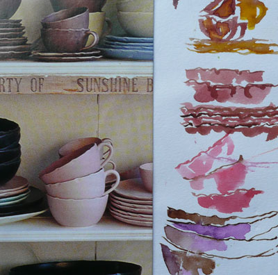
The next exercise is to interpret something from my sketchbooks, also in pastel shades, in a pointillist style. Well, a quick glance through them reveals that even when I paint something that looks pastel-ish, I make it stronger or brighter or even a different colour! So I think the next exercise is actually to sit down with my sketchbook and some paint that includes liberal amounts of white, and see how pale and interesting I can be…

painting crockery

circles and Craft

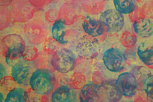
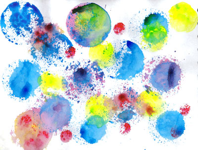
I had fun in my reinvented room yesterday, printing and painting with acrylics. I set out to make a background for a piece I’m doing for the Embroiderers’ Guild Members’ Forum Summer Challenge – which is to make a small piece without fabric – anything else goes. Along with it we’re swapping ATCs along the same lines – I made mine already – my first(!) – but I can’t post a pic till after the swap next week. I love circles and using these sponge brushes from Art Van Go, so I got a bit carried away!

sponge brushes
printed, painted papers

The first piece is for the Summer Challenge.

sponge print

Then I discovered I could make some interesting swirly effects by twisting the sponge with different amounts of pressure, so I played around with that for a while. I don’t know yet if I can get this kind of effect on fabric.

sponge prints
sponge prints
sponge prints

Craft magazineLast week I was pleased to find a copy of Craft magazine in WH Smith in Kendal – I’ve been interested in this since the first issue came out but it’s quite expensive (£7.99) and I didn’t want to subscribe without seeing it. It’s full of articles about makers (I loved David Mach‘s Myslexic), and off-the-wall projects (some of these might adapt for my youth club craft session, where fast and funky always go down well). There’s a special feature on dressing up, a look at open source patterns and a whole lot about recycling and refashioning. At 176 pages with minimal advertising, it’s like a small book. I love it – I hope it’s come to the UK to stay.

happy and sad

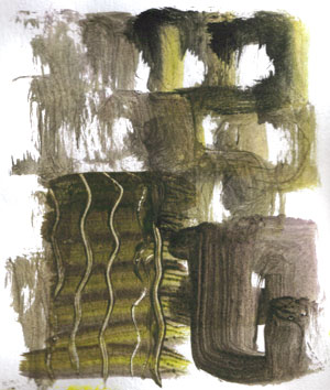
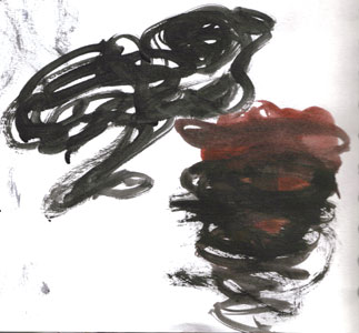
In OCA Textiles 1 right now, I am working on the use of colour to convey concepts like happy/sad… and how resistant I am to putting sadness onto my paintbrush. Maybe because I have been feeling a little sad myself this week, I want – I only want – to paint colours that bring me joy. Interestingly, the word ‘sad’ was once commonly used as an adjective for colour, meaning

Dull; grave; dark; sombre; – said of colours. “Sad-coloured clothes” (Walton)
“Woad, or wade, is used by the dyers to lay the foundation of all sad colours” (Mortimer) dictionary.net

Sad colours were deep and dark, neutral, sober. In the OED I read that in the 18th century chemicals were added to dyes to ‘sadden’ the colours – to tone them down. So could I bring myself to sadden my colours – maybe a very dull and dirty looking brown would do it, or a constricting, choking black?

sad colours

sad colours

Debussy wrote

The colour of my soul is iron-grey and sad bats wheel about the steeple of my dreams.

Which is how I often feel. Yet even those greys and browns and blacks (or blues) – well, I wonder – I can’t help feeling that even the drabbest dingiest colour may be singing away quietly to itself in its own understated way, hiding a dark rainbow in its depths.

Really, in my head and my heart I’m with Calvin (for once)

There is not one blade of grass, there is no colour in this world that is not intended to make us rejoice. John Calvin

joy colours

joy colours