the last lap: the table runner

While I was looking at napkin rings and cuffs on Flickr, I saw this beautiful forest poetry cuff by Cathy Cullis, and it gave me the clue I needed for the final element in my hospitality piece. I loved the combination of fabric and text, and the frayed ‘wabi sabi’ quality, which echoes with my ‘imperfect’ theme. A cuff, writ large, could be a table runner. With that thought my objects suddenly turned into an installation.

I had the fabrics (and had already used most of them in the woven napkin rings).

indigo collection

I had the words, collected in my theme book. And I had – just – the time.

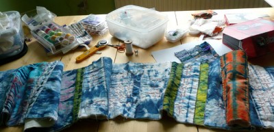
Piece, piece, piece and stitch, stitch, stitch.

work in progress

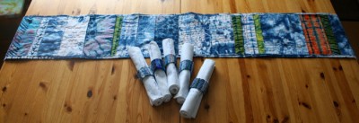
A day later – much later – and I had a table runner. The fabrics are all my own hand dyed indigo shibori pieces from various workshops long past. (Now I need to dye some more!). The text includes words from the Bible and quotations from Christine D Pohl’s Making Room and Jennifer Kavanagh’s The O of Home. I had puzzled about how to attribute these if I’d stitched them on a napkin; in this format it was easy, with a label on the back of the work.

So this is it, the culmination of all the work and experimenting and agonising and learning. The photos were taken in a bit of a hurry and a bad light before it all went into the package to catch the post (you have to get to the sorting office by mid-morning here, as the mail goes on the plane to Glasgow at lunchtime). When it comes back from my tutor I’ll take some better pictures and put them on Flickr.

table runner

table runner detail

There isn’t really anything I would change about it, a few small technical things maybe. I don’t think I’m really cut out for distance learning but I’m glad I stuck with the course and managed to finish with something I like. I couldn’t have got through this last week without the large amounts of encouragement and coffee provided by Alan, he was wonderful. I’m off for a walk by the sea now, and the next big thing is Woolfest – I can’t wait. I’ll be there both days and would love to say hello to any blogging friends who are going.

the last lap: changing direction

For the first trial felt mat, I decided to needlefelt dots of fibre within a circular area, leaving a border of undecorated felt where I was going to try writing some text. I can’t post a photo as I sent off the samples with my assignment without taking any, but it was – just – OK – really I didn’t like it at all! I spent some time stitching into and applying bits of fabric and fibre to another piece of felt and while there were lots of nice effects that I may use in the future, nothing was singing to me. I looked at my solitary mat and imagined a few more alongside it, and I knew this wasn’t what I wanted to do.

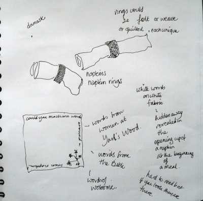
Soooo… back to the theme book to pick up on another of my early ideas – a set of napkins in napkin rings. Napkin rings are physically the perfect shape to embody both the embracing, enclosing aspect of the circle and the openness I was trying to convey. Embroidering text onto napkins would mean that it could be rolled up and half hidden, to be revealed in the act of opening the napkin and preparing to eat. “Hospitality can begin a journey towards visibility and respect” (Making Room, Christine D Pohl).

napkins in sketchbook

I still wanted a non-matching set, and at first I thought about making each napkin ring in a different way. I looked at various textile napkin rings and cuffs on Flickr, at how they were constructed and fastened. I sampled a quilted ring using indigo fabric, and I thought about weaving and embroidering, and I thought that they wouldn’t be a non-matching set but would just look as if I’d tried to include every textile technique I ever used! As Tim Gunn says, “Edit, edit”.

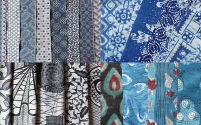
I thought about the cards I had wrapped with fabric and how exciting they were. I looked at my pile of blue and white fabrics from around the world, and my indigo shibori fabrics which include a few overdyed colours as well as much blue and white, and I decided to weave the napkin rings, all on the same warp, in fabrics using a free Saori style. Each one would start with a slightly different base point – Ghanaian batik, Indian block prints, sari silk, Javanese batik, and shibori, refecting cultural diversity. Indigo, forms of which are used in so many countries, would link them all together.

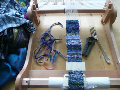
So I warped my little loom (for the first time!) and wove. I had been thinking about numbers, having decided that I wanted an odd number, as more in keeping with my theme, I settled on 5, since 7 is supposed to symbolise perfection and I didn’t want that. Thanks goodness, I would never have completed 7 in time!

weaving on loom

woven strips

I found the perfect napkins on Ebay, all the same size, all white damask, but each with a different pattern. I love that they are used, not pristine, and have their own hidden stories, if they could only tell. On each one I wrote, with stitch, the words of a detainee held at Yarl’s Wood, a UK detention centre for asylum seekers, a place which epitomises the very opposite of hospitality – a scandalous place where traumatised women and children are made prisoners. Yarl’s Wood Befrienders go to visit and support the detainees, and the words are taken from their web site, with permission. They are very moving. I stitched them over and over in shades of blue, moving from pale to dark, to reflect something of the “journey towards visibility”.

napkin stitched writing

five napkins

So I should be done, at this point. But no, that really is something else in the background. In a moment of mania I decided, not for the sake of the assignment, but for the sake of the work, that it wasn’t complete. I’d wanted to incorporate some of the snippets of text that I had jotted down throughout my theme book, but I hadn’t wanted to mix them up with the words of the detainees, detracting from both. So I was thinking hard about how to include them in the piece in a way that was continuous with the rest and added to the whole, and what I did is the next instalment…

the last lap: developing the theme

I should warn that this post is going to be long – it’s the tale of my final assignment for OCA Textiles 1, “A Design Project”. I’ve posted the package, I’ve written the evaluation, I just need to record the process and – I’m done. Three years including my deferment and my extension – and I’m still working right up to the deadline (today). A sensible woman might have written several shorter posts as she went along… Actually, I think I will write several shorter posts, just all on the same day…

This is where I had got to by 24th May:

I have probably enough ideas now for a whole series but have finally settled on a set of felted placemats with a blue and white colour range. Blue and white is used in two iconic types of china: willow pattern and Cornishware; in textiles indigo resists immediately spring to mind. I am currently looking at uses of indigo and blue dyeing in various cultures, shibori of course, but also adire, and work from India, Java and Hungary and will be starting to make samples shortly. I want the mats to make a united set but each one will be different, expressing the idea of welcoming a diversity of people around a table.

I serendipitously came across a recently published book by Jennifer Kavanagh called The O of Home, and think her ideas about embracing circles and broken circles feed into my concept. I was already playing with circles when looking at plates and bowls, and they are a recurring theme in my work as well. I see each mat with a blue and white circle or radial on a white/cream background (from undyed fleece). I have a number of ideas for the circles and will sample to find out which ones work best or if something different emerges…

I was also struck by a sentence in Christine Pohl’s Making Room about hospitality offering people ‘a journey towards visibility’. I am thinking about each mat having words free machine embroidered round the edge in white/cream, merging into the background – maybe quotes from the women at Yarl’s Wood or other people who have needed refuge and sanctuary. However, I think I probably need permission to use other people’s words in my work so it might not be possible to obtain that from the people involved, some of who may now have been deported. Another option I am considering is religious quotations about hospitality. Either way I would want these to be very subtle so that from a distance they are just an embroidered border and only emerge as text on a closer look. Sampling will tell me if I can pull that off.

Based on this I started to play with design ideas in my theme book. Because I planned to use nuno felt techniques I had a dyeing day to lay in a good stock of sheer blue fabrics; and I gathered together all the blue and white fabric/yarn/fibre and paper I could find.

dyeing blues
blue fabrics

I then made some felt samples. I began by making a couple of plain mats using different fibres – Shetland, Blue-faced Leicester, and one that was a mix of those two with some Merino. I decided to go with the BFL, which has a lovely textured surface when felted.

I also bought some sample packs of African, Javanese and Indian fabrics online (from The African Fabric Shop, Textile Techniques, and the lovely Glitz and Pieces on Etsy). I looked at some beautiful indigo textiles from Japan and Hungary as well, but they only came in big pieces, way beyond my budget.

fabrics from Africa, Java and India

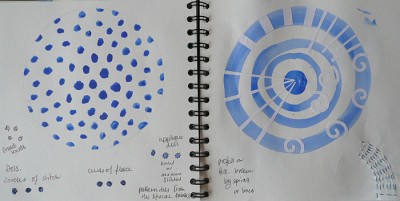
These are the ideas for circles on felt that I recorded in my theme book. I was thinking that they should all be open in some way, circles without edges, to symbolise that within this enclosing shape, no one is shut out.

sketchbook circles 1
sketchbook circles 2
sketchbook circles 3
sketchbook circles 4

Meanwhile, I wrote to the Yarl’s Wood Befrienders who kindly gave permission for me to use the words of detainees from their web site.

context and originality (or ‘who said it first?’)

In her comments on my fabric manipulation assignment, my tutor mentioned that when writing about my work I should ‘extend [my] frame of reference to include the work of other artists and craftspersons’ – to show that I’m aware of contemporary and historical textiles and to show how I’m influenced by others.

I must admit I sometimes avoid looking outward very far, for fear that I’ll find someone else doing just what I’m doing. I have had that experience once or twice, and I know it’s happened to other people too. I don’t mean copying – I mean that strange phenomenon where several people in far-flung places all start doing the same thing at the same time.

But, how important is that desire to be different? We have this strange Western obsession with originality (or I do anyway). Yet my most treasured comments are when someone has said my work inspires them – which I take to mean that something about it passes into their work or their way of seeing. And I don’t actually mind if people copy something I’ve done, if it’s in order to learn something or take something further – not in a commercial context, and I hope not without acknowledging it! As much as I can, I try to share my processes as I go along anyway. So I should surely take off those anxious blinkers and pay more conscious attention to who might be inspiring me, whether it’s in technique or style or philosophy. As my tutor says, ‘No-one works in a vacuum.”

So thanks, Julie, for mentioning Alice Kettle’s recent Place Settings series – it set me off on a trail of discovery. Here’s one of Alice Kettle’s collaborative pieces with Helen Felcey. There are more on her website under the ‘New Proj’ heading. I think these pieces are absolutely beautiful, lovely lines that move between the cloth and the ceramics, delicate shimmery spoons and cups set against the scribbly textures of Alice Kettle’s embroidery.

A search for place settings in art led me to some other works too. One was Judy Chicago’s famous piece “The Dinner Party“. I had read about this celebration of the lives of women throughout time before, but the power of the web means it’s now accessible in a 3D tour where you can virtually wander round the table. Quite awe-inspiring in its scale and execution, even just on-screen.

The second piece I found is a work in progress – also a large-scale installation – weaver Eleanor Pritchard’s Place Setting. This will be at Orleans House Gallery, Twickenham, from 12 June – 26 September 2010. Eleanor Pritchard says the work is ‘essentially a project about dining’ – her guest list includes all kinds of people from aristocrats to nursery maids. I’m glad I recorded the idea of narrative stitched into napkins in my ‘hospitality’ theme book before I found this site – that originality thing again! One of my ideas for the hospitality piece was to machine embroider the words of asylum seekers, their responses to receiving welcome, as white words on white fabric, ‘hidden away’, ‘revealed in the opening up of a napkin at the beginning of a meal’, ‘hard to read but if you look they are there’. I decided on placemats, not napkins, in the end, and I may not use the writing idea (though it’s still in the mix) but the uncanny similarity of intention remains. Eleanor Pritchard’s embroidered stories are central to her installation and will reflect the lives and narratives of her guests in 24 damask napkins. That is just a part of this work, which I think is going to be amazing and well worth a visit if you are within reach.

The last piece I found, which again has some elements in common with my theme, is not a large public work, rather a personal gift, but public nonetheless by virtue of being on Flickr – Samantha‘s lovely, quirky set of 6 ‘mismatched placemats‘ for a wedding anniversary gift. If I tell you I had already decided that my ‘hospitality’ piece would be 6 mismatched placemats and that they would be blue and white, you may guess that I did indeed start to feel a bit worried at this point! In fact the resemblance ends there and is actually quite incidental, but it does show that very few ideas are really unique – however hard you strive to be ‘original’. So I think I’ll stop fretting about that and just enjoy the connections!

Speaking of enjoying connections, I occasionally make a Flickr gallery, it’s easy to do and a great way of collecting some lovely and interesting work together in a complementary way. With blue and white very much on my mind, here are two to share with you: blue and white cloth and blue and white cloth 2. I hope they make up for the lack of pictures in this post!

playing with colour

One final post about the ‘Textile Structures’ module – though actually it’s the first exercise – working from a visual source and analysing colour, texture and proportion. Choosing an image and first painting blocks of colour, then wrapping card with yarn, is intended to make you look closely at the colours and their qualities and proportions. I lost some of the lightness of the image in my painting and in the yarn wrapping but regained it, I think, in the fabric wrapping, which is much more visually textured.

analysing colour texture and proportion

I liked the result of wrapping with fabric a lot so I made another, this time just working with the colours in the fabrics. When it was done I realised that the sketch book page on which I’d used up my left-over paint would make just the right background for it!

colour wrapping

Wrapping is often used solely as a design exercise but an artist here on Tiree has made it into her own very distinctive art form. Susan Woodcock creates evocative seascapes and landscapes, full of colour and movement, combining paint and textiles in a way that perfectly captures the island atmosphere. Her husband Colin Woodcock, is also an artist, a painter whose work explores ‘the interplay of land, sea and sky’, and is filled with the beautiful light that is so special to Tiree. Together they run the Blue Beyond Gallery, where Colin also creates his dramatic raku pottery. Every week in summer you can go to watch the pots being fired – a fascinating process – and very hot!