well, it’s done…

… the ‘when will this ever be finished’ wall hanging for City & Guilds Patchwork & Quilting is now finished!

This was my first experiment using felt as the batting so it became an integral part of the design. The assessment was to make a piece using appliqué techniques. It has three layers – painted silk organza, handmade felt, and painted silk pongee. The shadow appliqué shapes are hand dyed cotton and hand painted silk, and the machine and hand quilting are in cotton.

I cut back the top layer of some of the shadow appliqué and machine quilted areas after quilting them. I finished the edges with buttonhole stitch and then needlefelted them to break down the stitches into the felt. The support is a piece of driftwood I found on the beach, and the work is 53cm x 78cm (or 76cm x 78cm if you include the wood).

applique hanging

applique detail

applique detail

applique detail

applique detail

thinking about cloth and limitation

The first task for starting work on manipulating fabrics was to sort the fabrics into colour groups, and the course suggests two hours to do that and cut samples from each type of fabric for a pinboard. I have too many fabrics, I think! I will take a little longer over it because it’s a good motivation to get them organised so I know just what I have to work with. I always find sorting anything a bit of a challenge because I see too much as borderline (it’s the same with my filing cabinet). I knew that aspect of it would be hard, so I designated a pile for patterns and mixtures as well as the clearer colours and just threw anything too complex on that pile instead of spending time trying to make small decisions.

I sorted about half the fabric yesterday, and today I made some sample sheets, using only my own dyed fabrics. I’ve done them loose-leaf so I can keep them in a folder and add to them, and I’ll just pin up the whole sheets for reference. These are all cottons and silks, so tomorrow I’ll make some more sheets with other types of fabrics from the sorted colour boxes.

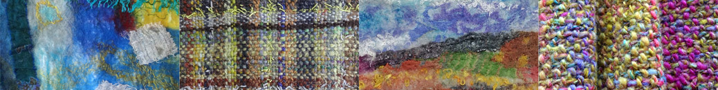
The idea is to make it easier to pick out the ‘right’ fabrics for collages to interpret some of my design work – it will certainly be more systematic than my usual method of just diving into an amorphous mass of colour and texture and pulling something out. I got out my copy of Jean Littlejohn’s Fabrics for Embroidery, as I thought it would be good background reading for this section of the course, and this kind of recording of fabric is the first thing she suggests – every time you get a new one, stick a little piece in your notebook… I should obviously have taken more notice when I first read it many moons ago!

fabric samples

On the subject of having too much fabric, Littlejohn points out that before the expansion of the fabric trade, people were limited to the materials in their local environment,

These limitations encouraged people to be endlessly inventive with the materials at their disposal.

I know I have a tendency to collect more, rather than using up what I have, not just new fabrics but new ‘must have’ products and new techniques as well. There’s a place for these, of course, but I think it’s also an important challenge for me to learn how to practise the traditional skills that my grandmother would have recognised, and to be inventive with the stuff I already have (some of which once belonged to her, in fact).

I was thinking about limitations and about the way people would use and reuse fabric in the past, and I did a mindstorm on the words wear/worn as the first step towards constructing a garment (or part of one) which comes a bit later in the course. That piece has to relate to and grow visually from the design work I’ve done so far, as well as what I’m about to do, but I think I also need to anchor it in some way, otherwise I’ll flounder. The work I did in January for Sharon’s Take it Further Challenge gave me a new sense of the power of limiting and channelling ideas, and it also showed me how much strength I personally can gain by playing with words and thoughts as part of the design process.

mindstorm

assignment 2 is done!

I knew it had been a while since I last blogged but I was a bit surprised to see just how long. I have a good reason, though – I’ve been immersed in finishing my second assignment for OCA Textiles 1, finally put in the post (just) on time on Monday. It takes ages to get everything labelled and organised for sending to my tutor – I must try to do more of that as I go along. These are the two larger printing/painting samples I finished at the weekend. The top one is a repeating pattern that could go off the edges of the fabric – scrunch dyed cotton fabric, block printed with fabric paints, then stencilled with masking tape stencils in two layers, the first layer applied with a natural sponge, and the second layer applied with a sponge roller. When I’d done that, I thought the purple stripes were too strong against the background fabric, which was quite pale in places, so I painted the whole thing with thin turquoise paint and then rinsed it before setting.

The bottom one is a single unit inspired by log cabin patchwork. It’s all block printed, the ‘log cabin’ with funky foam blocks with holes punched into them, and the round shapes with carved erasers. The fabric is silk, and I used fabric paints as I wanted that brushy texture in the colour.

printed fabric

printed fabric

The next section of the OCA course is fabric manipulation and making an actual object like a bag or a waistcoat, which sounds great, but I must also finish the appliqué piece and get on with the final assessment for City & Guilds. I think if I really pull out the stops I might be able to finish it before my registration runs out in mid-December.

Draw Something Every Day

doodling

The Draw Something Every Day challenge. This started off with me thinking about pastel colours for an assignment. I saw a big heap of candy coated chocolate eggs on a market stall and started doodling shapes and arrangements for a potential design.

The assignment was to do colour mixing with pastel colours using a pointillist stitch technique in a design derived from an image. I tried to do some painting and drawing in pastel colours using shells and stones and flowers, but there was nothing I wanted to take further. I found it came more naturally to work the colours directly in the stitching in a more abstract way. It is inspired by the candy eggs and the doodles but has taken on a life of its own.

pastel French knots

more French knots and other dots

I hoped I would get a bit more done last week, art-wise, than I did, but there was more work (day job) than I expected (which is good, really) and so in the end I was squeezing the art in around it. I did the machine quilting on the second of three panels for the appliqué assessment in my quilting course, and started on the hand stitching. It’s crazy, really, to be doing large amounts of hand stitching on a project like this when time is short, but I am, because when I decided to do that, it turned from an assessment piece I ‘had to get done’ into something that I feel engaged with and might even want to look at again afterwards.

For OCA Textiles 1, I’m still working on the pointillist stitching exercises. I tried some different stitches…

pointillist stitching

… and then French knots at a different scale, though not (yet) with rope as envisioned by Jude in her comment! This was just tapestry wool on canvas.

pointillist stitching

I enjoyed this exercise, which was to blend pastel colours across a sample. Though I had to scrape the barrel a little to find any pastel colours at all in my thread collection – just a few silks left over from something I made for my niece when she was a baby (she’s practically a teenager now and I don’t seem to have bought any thread you could call pastel since then – a few knitting yarns, that’s all).

blending stitches

The next exercise is to interpret something from my sketchbooks, also in pastel shades, in a pointillist style. Well, a quick glance through them reveals that even when I paint something that looks pastel-ish, I make it stronger or brighter or even a different colour! So I think the next exercise is actually to sit down with my sketchbook and some paint that includes liberal amounts of white, and see how pale and interesting I can be…

painting crockery