Yesterday’s post on Ragged Cloth Café mentioned a fascinating site – WebExhibits – there are sections on the causes of colour, pigments through the ages, and colour vision and art. Be warned, once you start exploring you just keep finding more to see – for instance Laura Joy Lustig’s very striking Building Views – “abstract, hand coloured photographs of architectural and constructed scenes”.
happy and sad
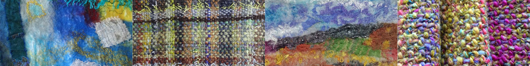
In OCA Textiles 1 right now, I am working on the use of colour to convey concepts like happy/sad… and how resistant I am to putting sadness onto my paintbrush. Maybe because I have been feeling a little sad myself this week, I want – I only want – to paint colours that bring me joy. Interestingly, the word ‘sad’ was once commonly used as an adjective for colour, meaning
Dull; grave; dark; sombre; – said of colours. “Sad-coloured clothes” (Walton)
“Woad, or wade, is used by the dyers to lay the foundation of all sad colours” (Mortimer) dictionary.net
Sad colours were deep and dark, neutral, sober. In the OED I read that in the 18th century chemicals were added to dyes to ‘sadden’ the colours – to tone them down. So could I bring myself to sadden my colours – maybe a very dull and dirty looking brown would do it, or a constricting, choking black?


Debussy wrote
The colour of my soul is iron-grey and sad bats wheel about the steeple of my dreams.
Which is how I often feel. Yet even those greys and browns and blacks (or blues) – well, I wonder – I can’t help feeling that even the drabbest dingiest colour may be singing away quietly to itself in its own understated way, hiding a dark rainbow in its depths.
Really, in my head and my heart I’m with Calvin (for once)
There is not one blade of grass, there is no colour in this world that is not intended to make us rejoice. John Calvin


appliqué in progress
I made good progress today with the appliqué wall hanging which is my first assessment piece for City & Guilds 7822. I got all the shapes laid out ready to shadow quilt. On the left of the pic is the overall design; on the right, how it will change with painted silk organza pieces laid over it. After it’s quilted I’ll be cutting back into it to reveal some of the coloured shapes and the felt batting again. I’m sure I’ll be tweaking the composition but this is about it. I’m going to treat myself to some variegated machine threads at the Festival of Quilts, so I won’t stitch it till after that, but I can get the pieces fused to the felt and think about the quilting for a few days. Now that I see the appliqué pieces on the felt, I’m not sure that I’d go on to add the top layer if it wasn’t for a quilting assessment, but I think if I’m careful with placing the stitching I can cut back effectively to get some interesting contrasts.

I tried a technique from Tray Dyeing yesterday – not with Procion MX dyes (as used in the book), because I don’t have everything I need for that yet; but I dyed some strips of silk with Javana silk paints. These bits were torn off the edge of one of them to put in my sketchbook – I sent the piece off to my daughter with some other bits, and forgot to take a photo. I used lemon, magenta, and cyan together – I love the resulting zingy colours. The silk was dry and loosely scrumpled in a small box before squeezing the colours on with a pipette.

I was reading a very interesting entry a couple of days ago on Karren Brito’s blog Entwinements – What people will do to wear red – about the effects of dyes on the skin – in clothing, not just while you’re using them. Food for thought, especially as I hope some of my dyeing experiments will end up in my wardobe. If you’re interested in dyeing there is some wonderful shibori including wearables on Entwinements.
photos from Aveiro
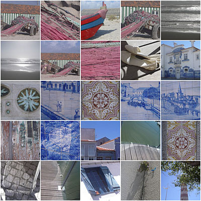
I finally managed to upload my photos of Portugal to Flickr. We had a lovely time in Aveiro staying with Palexa and she took us to some beautiful places. Some of the photos are mine and some are by Alan. I tend to focus on details and he on vistas but occasionally it’s the other way round… Looking at them makes me want to be there again! Such wonderful sun and light. Thanks Palexa for lending us your camera 🙂
weekend’s work
I’ve been painting some colour wheels for OCA Textiles 1 – they didn’t turn out quite as I expected, though. I was using Brusho inks and I don’t know if it was the way I mixed them but the lemon and the golden yellow were so similar in hue that I didn’t get all the variations I was expecting. I’ll have another go with some gouache paints. Then I spent a bit of time mixing tints and tones in acrylics and experimenting with mixing in touches of a complementary colour. I could do this kind of thing all day long – I just love it.

I’ve also been painting silk organza and pongee for my appliqué hanging for City and Guilds – one piece of each in reds, one in greens and one in purples. These are fronts and backs to go with these felts. The next stage is to machine quilt the three layers, incorporating shadow applique, then cut back into it to expose some of the felt. The organza will be the top layer.

I found this picture on the camera as well – it’s the sky from my office window, one evening a few weeks ago when it wasn’t quite as wet as today!
