Take it Further challenge

I have been mulling over Sharon B’s Take it Further challenge for January – this is from her blog:

The key concept for January is a feeling we have all had, the feeling of admiration for another. Ask yourself who do you look up to and admire? Why? What is it you admire about them?… Take the idea, develop it into a resolved design during that month and apply it to fiber or paper.

There’s also a colour challenge but I’m going to focus on the concept each month as it’s in this area of visualising the abstract that I know I really need to be challenged.

I struggled for a while with this concept, finding that there seemed to be no-one I could admire without reservation – I was relieved to read a very clear articulation of something of the same feeling from Liz at Dreaming Spirals; and stunned by the imaginative way she’s resolving it. I think a combination of stifling perfectionism and a deep-seated desire not to be misunderstood were combining to paralyse me and I wondered about pulling out of the challenge…

But reflecting on what is common to the people I admire – often people whose names I don’t know or couldn’t share (sometimes quite hidden, usually quite humble), I realised that it’s often precisely because they are such a mixture of opposing qualities that I admire them. I’m drawn to the way they’ve confronted their particular darkness by allowing something bright and fierce and tender and courageous to grow in their lives. I began to think about radiance and colour breaking through strong bonds or tangled chains. I’m remembering an image from LeGuin’s A Wizard of Earthsea, a ‘clot of black shadow, quick and hideous’. And seeing tendrils, tiny shoots, frail in themselves, but becoming tenacious and powerful as they grow.

This is all a bit scary – I discover I don’t really like to expose my thought processes before I know where they are going or if I can make anything of them. It feels too vulnerable.

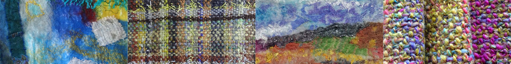
As to technique, I’m using the challenge to make myself work more consistently in a sketchbook so at this point I think my entries will be pages from a visual journal. It will allow me to explore the ideas in more than one medium and it fits in well with my other commitments.

happy and sad

In OCA Textiles 1 right now, I am working on the use of colour to convey concepts like happy/sad… and how resistant I am to putting sadness onto my paintbrush. Maybe because I have been feeling a little sad myself this week, I want – I only want – to paint colours that bring me joy. Interestingly, the word ‘sad’ was once commonly used as an adjective for colour, meaning

Dull; grave; dark; sombre; – said of colours. “Sad-coloured clothes” (Walton)
“Woad, or wade, is used by the dyers to lay the foundation of all sad colours” (Mortimer) dictionary.net

Sad colours were deep and dark, neutral, sober. In the OED I read that in the 18th century chemicals were added to dyes to ‘sadden’ the colours – to tone them down. So could I bring myself to sadden my colours – maybe a very dull and dirty looking brown would do it, or a constricting, choking black?

sad colours

sad colours

Debussy wrote

The colour of my soul is iron-grey and sad bats wheel about the steeple of my dreams.

Which is how I often feel. Yet even those greys and browns and blacks (or blues) – well, I wonder – I can’t help feeling that even the drabbest dingiest colour may be singing away quietly to itself in its own understated way, hiding a dark rainbow in its depths.

Really, in my head and my heart I’m with Calvin (for once)

There is not one blade of grass, there is no colour in this world that is not intended to make us rejoice. John Calvin

joy colours

joy colours

expressive markmaking

I’m struggling a bit with the exercises in expressive markmaking for Open College of the Arts Textile 1. I can spend hours making marks – some that I like, some that I don’t, in different media and with different techniques, but I don’t naturally see any of them as expressive of sadness or happiness, even when I am trying to convey these specific emotions. I am making judgments about them, but not related to mood. I see them as interesting, boring, ugly, beautiful, etc, and I don’t have too much trouble with strongly visual words like sharp, smooth, delicate, but I get more doubtful when it comes to words like fast and slow, hard and soft. That is – I can relate those words to the gestures I’m making when I make the mark, but when I look at the mark, it doesn’t seem to reflect the speed of the gesture. Or a softly placed mark doesn’t say ‘soft’ to me.

Not sure where I’m going with this, just getting the thoughts out.

While I was musing and wondering about it yesterday I googled for expressive markmaking, and rediscovered TRACEY, an online journal devoted to contemporary drawing research. Specifically the issue on Syntax of Mark and Gesture. Masses of material here – I’ve bookmarked this to read over the next week or so. Following their links I also looked at Access Art and their online workshop ‘Draw!‘. After that I thought I am just being too precious ahout this and I sat and brainstormed in my journal some other evocative words and visual ideas around what sadness and happiness mean to me.

happy and sad words

During the week I’ll spend some time finishing the exercise by making marks around these thoughts. But today I’m going to go on to the next stage, using marks to create surface textures.

These are some of my favourite efforts from yesterday. I notice they are all paint, except the first which is a candle resist with an Inktense pencil wash. The results I get drawing with pastels, crayons, etc don’t grab me much – maybe an indication that I need to spend a little more time getting to know these media. They work well for me in rubbings, stencils and so on, but not when it’s just me and my bare hands!

markmakingmarkmaking

markmaking

markmaking