stitchin fingers, cyborg knitting, and the threads of story

A couple of things have caught my eye recently …

First is the new social network, Stitchin Fingers, started a few days ago by Sharon B of In a Minute Ago, and already looking like a great place for anyone who practises textiles to explore and enjoy. 

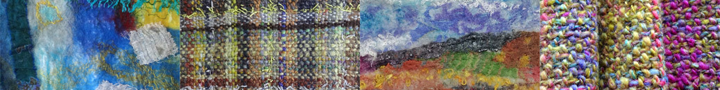
Next is Spyn. Alan brought a short flyer back from CHI 2008 about “a system for knitters to record, recall and share information surrounding the processes of handcraft”. It’s a prototype design using digital techniques to literally craft personal stories into the knitting.

That set me thinking about metaphors we use in English that link story and fibre – we talk about losing or picking up the thread of a narrative; of spinning a yarn; of unravelling the truth. Maybe others…

I was also reminded this week, by this post on Blue Beyond by Tiree artist Colin Woodcock, of a Hans Andersen story I loved as a child. The princess spins a yarn of nettles to knit shirts that will free her brothers of the evil enchantment that has turned them into swans. Her hands are burnt and blistered and she is forbidden to speak, but the pain and love she may not articulate is embodied in the healing garments she creates.

And something else comes to mind – I’m always a little overwhelmed by the fact that text and textile are actually, etymologically, related:

“The word text is a cognate [of textile], coming from Latin textus ‘that which is woven’, referring originally to a particular style of Medieval script which was so dense that it looked like weaving.” 
Quoted from Take Our Word for It Issue 33

I’m suddenly feeling very excited about the possibilities here.

knitting, with woven yarn

Draw Something Every Day

doodling

The Draw Something Every Day challenge. This started off with me thinking about pastel colours for an assignment. I saw a big heap of candy coated chocolate eggs on a market stall and started doodling shapes and arrangements for a potential design.

The assignment was to do colour mixing with pastel colours using a pointillist stitch technique in a design derived from an image. I tried to do some painting and drawing in pastel colours using shells and stones and flowers, but there was nothing I wanted to take further. I found it came more naturally to work the colours directly in the stitching in a more abstract way. It is inspired by the candy eggs and the doodles but has taken on a life of its own.

pastel French knots

more French knots and other dots

I hoped I would get a bit more done last week, art-wise, than I did, but there was more work (day job) than I expected (which is good, really) and so in the end I was squeezing the art in around it. I did the machine quilting on the second of three panels for the appliqué assessment in my quilting course, and started on the hand stitching. It’s crazy, really, to be doing large amounts of hand stitching on a project like this when time is short, but I am, because when I decided to do that, it turned from an assessment piece I ‘had to get done’ into something that I feel engaged with and might even want to look at again afterwards.

For OCA Textiles 1, I’m still working on the pointillist stitching exercises. I tried some different stitches…

pointillist stitching

… and then French knots at a different scale, though not (yet) with rope as envisioned by Jude in her comment! This was just tapestry wool on canvas.

pointillist stitching

I enjoyed this exercise, which was to blend pastel colours across a sample. Though I had to scrape the barrel a little to find any pastel colours at all in my thread collection – just a few silks left over from something I made for my niece when she was a baby (she’s practically a teenager now and I don’t seem to have bought any thread you could call pastel since then – a few knitting yarns, that’s all).

blending stitches

The next exercise is to interpret something from my sketchbooks, also in pastel shades, in a pointillist style. Well, a quick glance through them reveals that even when I paint something that looks pastel-ish, I make it stronger or brighter or even a different colour! So I think the next exercise is actually to sit down with my sketchbook and some paint that includes liberal amounts of white, and see how pale and interesting I can be…

painting crockery

day out and colour mixing

Tuesday sounded as if it was going to be the last fine day for a while, so Alan suggested we went into the Lakes for a few hours. We drove up towards Keswick and over Honister Pass, then on to Whinlatter (a favourite haunt when our girls were children). I had fun taking pictures from the van window on the way, one or two turned out to be quite interesting combinations of blur and focus.

leaves through leaves

The range of autumn colours in the mountains is incredible.

mountain colours

This is the spectacular metal sculpture of an osprey outside the Visitor Centre at Whinlatter. (Real ospreys nest in the area). I’ve uploaded some more images to Flickr.

osprey sculpture

I have been working on colour mixing exercises with stitch for OCA Textiles 1, using dotty stitching – French knots in a pointillist style. This calls for good primary and secondary colours, and I soon discovered that I actually have very few of those in my stash – mostly variegated threads and random bits and bobs. I started a very small sample in some red and yellow threads I dyed a while back, and ran out of those, so today I went down to town and bought a small rainbow – well, two rainbows, one in stranded cotton and one in wool. That should keep me going for a while!

threads and French knots

I was in the library too and saw this dramatic, enormous knitting installation in the foyer. They said I could take some pics to share with you. Kendal is a town whose history is intimately connected with wool production – its motto is ‘pannus mihi panis’ – ‘cloth is my bread’, or as people often interpret it ‘wool is my bread’. We even have our own breed of sheep – the Rough Fell. This project celebrates that heritage.

timewarp2.jpg
Timewarp
about Timewarp

getting on with some Textiles exercises

I’ve been conscious that though I’ve been doing lots of of textile-y and colour-related things, which I’m sure contribute to the learning curve I’m on with OCA Textiles 1, I haven’t done any actual exercises since August, so yesterday I sat down and did the next two from the course folder. The first involved choosing images that have a colour scheme I feel drawn to and collecting fabrics and threads to match the colours. This was fun – I chose a couple of postcards – one is of the stained glass window designed by Patrick Heron for the Tate in St Ives, Cornwall, and the other is Liesbeth Lange’s photo of ‘Colours from Nepal’ – I guess they are dyes, but I don’t really know.

matching colours

The second exercise was to stitch onto a black background using two primary colours. I am finding that the more I hand stitch the more I enjoy it – it takes time, which I lack, but the patterns are so lovely and I’m fascinated by the variations that grow between one stitch and the next.

stitching with primary colours

I’m off now to make a few sample paper beads to take to youth club tonight, but I must just mention a magazine I read about yesterday on MissMalaprop.com. Worn Fashion Journal sounds like a great publication for anyone who’s interested in fashion design, wearable art or the cultural meanings of clothing.